

Page Redesign to Renew Health Insurance Plan
My role focused on user research, usability testing, and visual design.

Project Overview
Client: Centene, a healthcare company that provides health insurance plans.
Task: Redesign a page that helps members understand their health insurance benefits and encourages them to renew their plan for 2021 during the Open Enrollment season.
Challenge: How can we make sure members understand the benefits of their plan and encourage them to renew despite price increases?
My role: User Researcher, Designer, Tester, Content Strategist
Team: I worked with 1 product manager; 5 engineers; 1 quality assurance engineer; 1 data analyst
Duration: 5 months (2020)
The Main Gist
I worked on a cross-functional team to redesign a page that helped members understand their health insurance benefits. Based on user insights, I made price increases more transparent and highlighted key plan benefits. As a result, 76% of our members renewed their plan for the following year during the Open Enrollment season.
My Process

Phase 1: Research and Discovery
I began by doing a heuristic analysis and looking at survey data from last year to get a baseline for what needed to be improved on the page.
Every year, during Open Enrollment, members of any health insurance plan have the option to renew their plan for the following year. They do this by logging into their health insurance plan’s account, reviewing their benefits, and choosing to re-enroll. For this project, my task was to look at the page from the past year (2020) where members re-enrolled and redesign it to highlight key member benefits, with the ultimate goal of encouraging them to renew their plan for 2021.
To begin, I did a heuristic analysis of the page from the prior year to uncover what usability and content issues we needed to address. I used NNG’s 10 Usability Heuristics for User Interface Design, since they are data-based and well-established in the industry.

Screenshot from the heuristic analysis. My comments are on the yellow and blue stickies.
I also looked at the analytics we had on page usage from the previous year, as well as survey feedback we had gotten from users of the page from the previous year. I did this to better understand what sections of the page were heavily utilized and what needed to be improved.
Finally, I ran a workshop with key stakeholders of the project, including PMs, engineers, our Director of UX, data analysts, and the heads of our departments to go over the goals of the project, review our learnings from the previous year, and get alignment on what features we wanted to prioritize.
From our research, I uncovered 3 major issues on the page that I wanted to tackle:
Notifying members of a price increase in their plan
Allowing members to cancel their plan
Highlighting the rewards program
If I had more time, I would have done one-on-one interviews with members to better understand how they feel about seeing a price increase and their feelings about health insurance during this unique time.
Phase 2: High-Fidelity Mocks and Content
Using the insights I gathered from the discovery process, I created high-fidelity mocks (and later, a prototype) and rewrote the content for the page.
Next, using the insights I learned from the research phase, I put together many different variations of designs for the page using Sketch (Figma was not a popular tool in use at the time). I used Miro to annotate and present my designs to my PM and other stakeholders.
I did not think wireframes were necessary because we already had a version of the page that existed and I wasn’t making major structural changes to the page. For that reason, I jumped straight into high-fidelity designs.

A screenshot from a Miro board where I annotated my designs for stakeholders (in yellow) and let them comment their thoughts (red comment bubbles). I wanted to make it as easy as possible for my busy stakeholders to give me feedback.
I addressed each of the 3 main pain points that I uncovered during our research.
I added a prominent section on the page calling out that there was an increase in the member’s plan, with text explaining what their options are from there.
I added an FAQ to the page about how members can cancel their plan.
I updated the rewards section to highlight how many points the member has and what the points were redeemable for (seen in the image below).
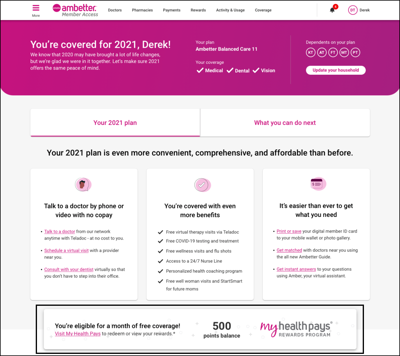
Screenshot of the new rewards section, highlighting how many points the member has and what the points are redeemable for.
Based off of my heuristic analysis and feedback from members from the previous year, I also rewrote a lot of the content to be more user-friendly and helpful.
Once the PMs and I felt that were the designs were in a good place, I turned my mocks into interactive prototypes to help me better communicate the functionality I wanted to our engineers. I then met with the engineers to understand what would be technically feasible and get an estimate of scope. I adjusted my designs accordingly.
Phase 3: Testing & Iteration
I ran 7 moderated usability testing sessions and several unmoderated tests via UserZoom. I tested how members used the page, what sections were confusing, and whether they understood the next steps they could take.
Next, I wanted to get the page in front of members to see if the content was clear and if the page was easy to understand and navigate. Health insurance is confusing and there is lots of terminology and jargon that can be hard to understand. It was important that people understood their plan benefits and how much they would be paying per month, especially in a post-pandemic world.
I set up moderated usability tests remotely via Zoom, for 1 hour each. Doing remote testing meant I could schedule time with participants all over the country. I was the facilitator for each session and my PM joined to listen in and take notes.
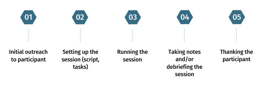
While I did not have to do any user recruiting for this project (we had a team that did this for us), I did the rest of the user outreach. I first contacted each user by email to ask for their availability and set up a time to run the session. I also wrote a script and came up with the tasks that each participant would be performing during the usability test.
Once the session started, I welcomed the participant and made them feel comfortable, explaining the purpose of the session. I ran them through each task and asked questions along the way, encouraging them to talk out loud. Some sample questions and tasks were:
Tell us how much your premium is for this year. How do you feel about this?
Let's say you want to make your first payment. How would you do that?
You want to cancel your plan. Show us how you would do that.
How many points do you have in your rewards program?
When writing my usability test script, I purposely wanted to test if we had addressed the pain points uncovered during the discovery phase, so I ensured that I had questions and tasks around those specific issues. After each session, my PM and I debriefed what we saw. I like to have debriefs right after each session because I find that’s when I (and my PM) had the most ideas and were most excited about improvements we could make. I ran an informal affinity diagramming exercise after all of our user tests to uncover common themes.
In retrospect, I would have made the usability tests 45 minutes each. While we got a lot of insights in 1 hour, a session of that length was mentally taxing for the user and for me as the facilitator.

A debrief after a usability test. I led an informal affinity diagramming exercise.
I also ran unmoderated tests on Userzoom, a remote usability testing platform, with 70+ users to test some of the smaller design decisions I was making, as well as reach a broader set of users quickly and get feedback efficiently. For example, I tested whether users could navigate the page on their mobile devices via Userzoom.
Based on our usability tests, I made a few key changes:
Participants said that when the cost of a member's plan went up, the content was too matter-of-fact, making members feel alarmed. I changed this language to make it softer yet still actionable.
Members were unsure what they could do with their rewards points, so I clarified that language.
FAQs were very helpful, so I made them a bit more prominent on the page.
Phase 4: Handoff & QA
I finalized my interactive prototype for the engineers and worked closely with them to ensure the page was built to match my design. I also QAed the page at every breakpoint.
Once the mocks were done and I incorporated the feedback from our user tests, I created an interactive prototype for our engineers so that:
They could see how the page should look and what design system components should be used
They could easily copy and paste the content as they were building the page
They could see how interactive parts of the page, like modals and expansion panels, should work
I also annotated my designs in Abstract (Figma was not a popular tool in use at the time) so that engineers could refer to my notes while they were building out the page. I also organized the designs into one central repository for easy navigation by the team. Finally, I met with the engineers regularly to answer questions. Once the page was built, I QAed it at every breakpoint and worked with engineers to make sure the designs were implemented correctly.

A screenshot of our Jira board with mostly UI tickets that I put in for the engineers.
Phase 5: Monitoring
Once the site was live, I set up a survey so we could get real-time feedback and make changes on the fly.
I knew that monitoring the page during Open Enrollment would be critical, as we wanted to continue iterating on the page based on real-time feedback. I added a survey that expanded as a panel on the page to capture member feedback. I chose this approach because I did not want to take members away from the page to give us feedback, and this was a non-intrusive way to do it. It was also very contextual - a member could leave us feedback right as they experienced an issue, for example. Based on this feedback, we made minor improvements and bug fixes throughout the time the page was live.

I added a feedback survey to the page. Members could expand it to launch a side panel where they could leave real-time feedback.
Results
During Open Enrollment, we saw:
240,000 unique visitors to the page
76% of the people who visited the page renewed their plan, as opposed to 63% who did not visit renewed
Members who visited the renewals page were 30% more likely to stick with us than those who didn’t visit the page
“Answered all my questions without asking. Thought I might have to go to the Marketplace to get this done.”
“Very easy to navigate and explained my coverage very well.”
Top Takeaways
I loved working on this project because it was very high-visibility - it was very important to Centene that members renewed their health insurance with them for the following year instead of going with competitors’ plans. While it was stressful at times, I was proud of the way I was able to balance business needs with user needs.
The main things I learned were:
I designed way too many variations of the page depending on who was viewing it. I had different language for different types of members. I did this to personalize the page and make it as relevant as possible to the user, but it made building out the page very slow because the engineers had to build in complex conditional logic. If I were to do this project again, I would try to design less variations to make it easier to build while also ensuring the language is relevant to the member.
I shouldn’t leave mobile user testing to the end. We had found that most members in past years had visited the page on desktop, so that’s where I focused most of my design efforts, but in retrospect, I should have spent more time testing my designs on mobile devices.
Want more?

City Parks Alliance was a project where I focused on user research, content strategy, and UX design.